On the significance of visual opposition … an artistic experiment.
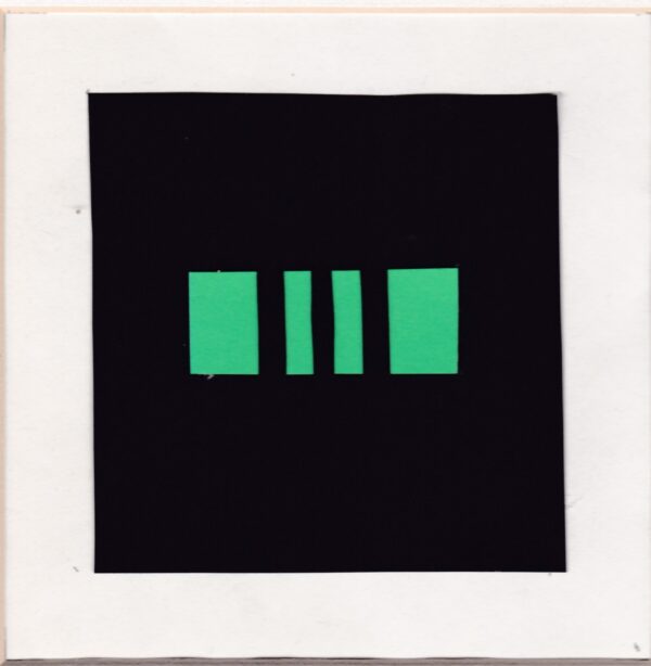
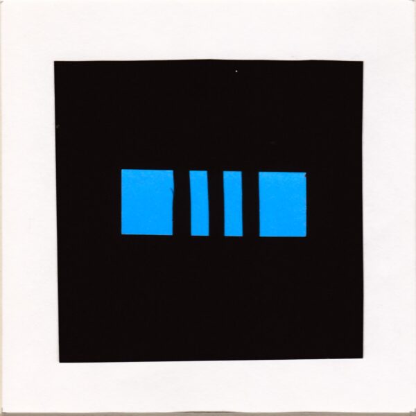
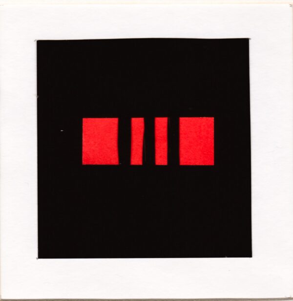
The original black background version of this collage started as a mental vision of three bars centered in a square. Graphic exploration led to a series of square black background continuing as bars across a rectangular coloured “window,” as shown above.
My sister, to whom I sent the original series of collages, found them “ominous,” threatening even, as she came to associate them somehow with the horrors of the Holocaust.
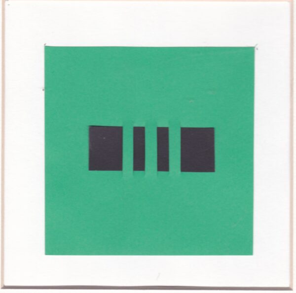
Sensing that the black background blending into the bars across a window opening to coloured light was the “ominous” visual combination, I wondered if by reversing the visual pattern I would somehow reverse the signification, or association, to a more “auspicious” one.
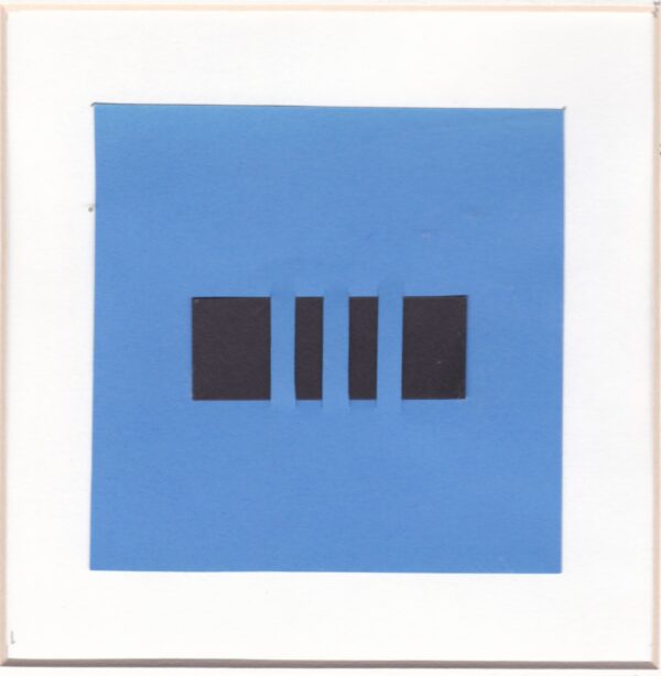
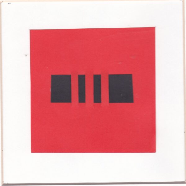
Reversing the colours of background to window elicited a “less somber” reaction from my sister, leading me to think she may have meant “less threatening”, if not “more auspicious”, as shown below.
Was there an equivalent opposition of meaning in the opposition of colour schemes … from “ominous” to “less somber”? Why, or how?
The answer, I suggest, lies in the perceptual dominance of the colour black making us perceive it as advancing vis à vis the other colours.
In the “ominous” scheme the viewer confronts an advancing and “threatening” black wall in the middle of which is a window one can only see through the bars crossing it.
In the “less somber” scheme the viewer is fronting a distant colored surface over which a black pattern seems to hover in a less “threatening” way.
What follows is the series of “paired opposites” hopefully demonstrating to the viewer their contradictory effects.
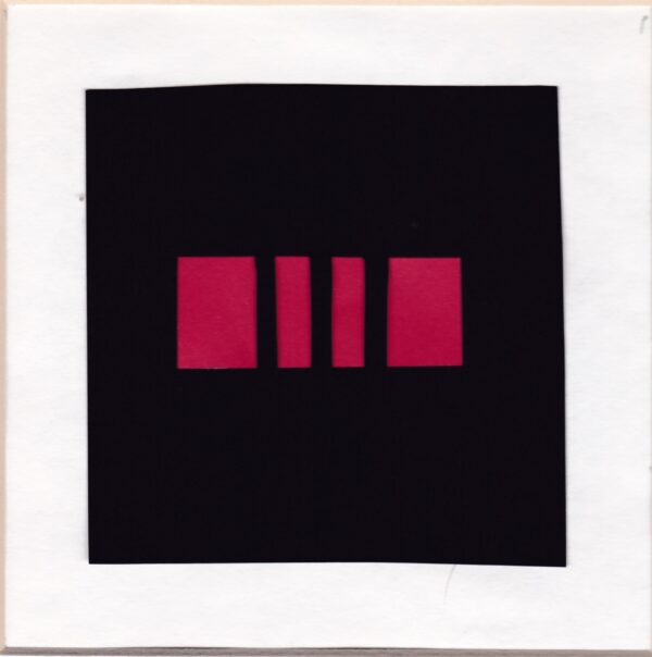
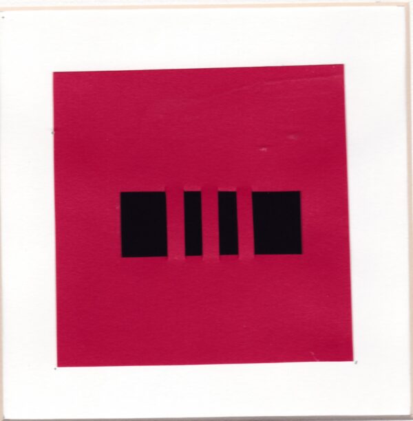
The red-black pair of visual opposite collages.
The blue-black pair of visual opposite collages
The orange-black pair of visual opposite collages
End words
The notion of “paired opposites” is a linguistic one we can observe daily in such automatic paired oppositions we mentally make as wet-dry, rich-poor, dark-clear, etc. covering the range of physical, social, visual states.
Finding that this notion can also be an “artistic effect” one, based on the perception of colour patterns, is what I wanted to share in this post.